> For the complete documentation index, see [llms.txt](https://docs.dashcomb.com/dashcomb-help-center/llms.txt). Markdown versions of documentation pages are available by appending `.md` to page URLs; this page is available as [Markdown](https://docs.dashcomb.com/dashcomb-help-center/ide/ui-component/divider.md).
# Divider
Dividerは主に画面デザインの際に使う区切り用のコンポーネントです。Dashcombが提供しているDividerは、区切り用以外に、管理画面の用途に合わせて、レベル文字の設定などもできます。
## プロパティ
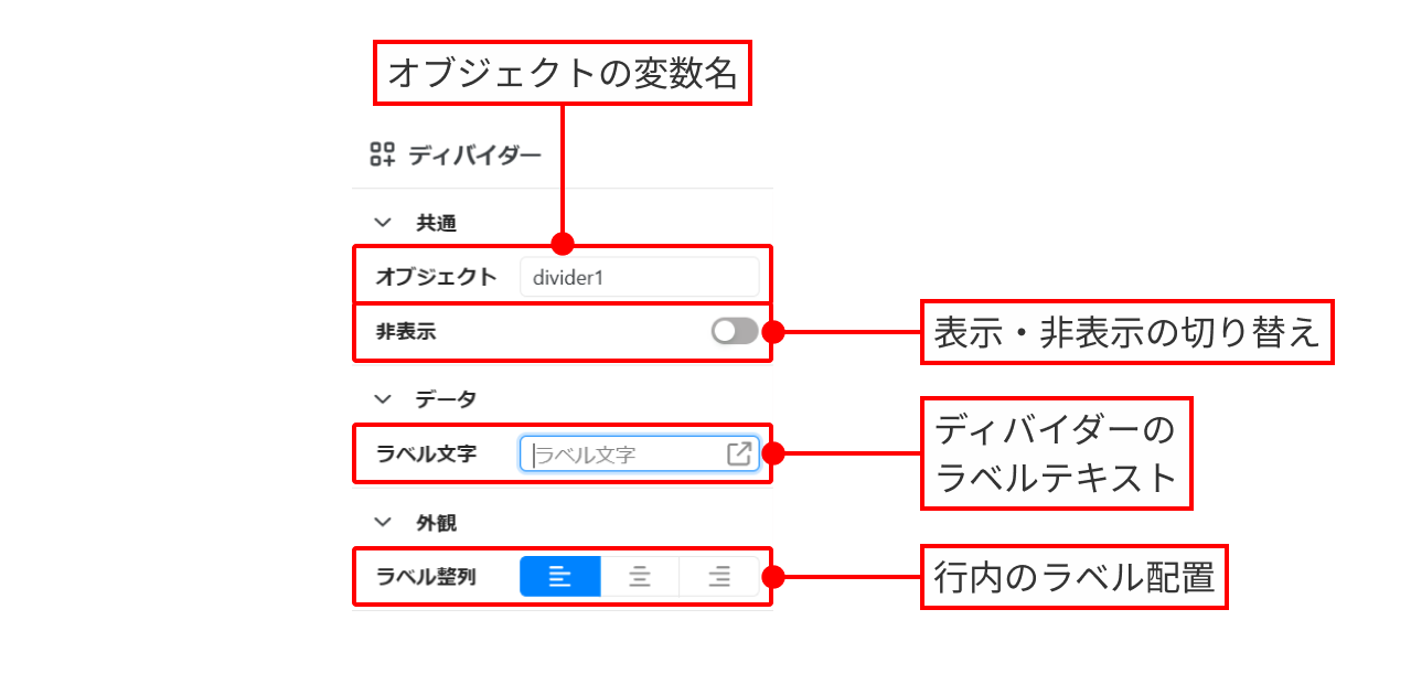
Dividerコンポーネントには、以下のプロパティが含まれています。
 ### 共通
**オブジェクト**
ディバイダーオブジェクトの変数名です。Dividerをドラッグ&ドロップすると、そのオブジェクトが自動的に `divider1`、`divider2`... と名付けられます。
ここで設定した変数名は、構文 `{{オブジェクト名.プロパティ}}` でオブジェクトを参照するために利用できます。
(例)`{{divider1.label}}` で `divider1` のラベルを取得することができます。
利用できるオブジェクトとプロパティは、[インスペクターメニュー](/dashcomb-help-center/ide/region/inspector-region.md) で確認できます。
#### 非表示
トグルスイッチをONにすると、ディバイダーが非表示になります。
現在の設定値は、`{{オブジェクト名.readonly}}` で参照できます。
### データ
#### ラベル文字
ディバイダーのラベルテキストです。画面を開いた時点で、初期値は空文字列("")です。
(例)オブジェクト `divider1` のラベル文字に `Dashcombはとても便利なツールです。` を入力します。
`{{オブジェクト名.プロパティ}}` 構文を用いて、動的に設定することができます。
(例)オブジェクト `divider2` のラベル文字に`{{currentUser.name}}` を入力すると、ログイン中のユーザーの名前が表示されます。
{% hint style="info" %}
`{{}}` 構文については、[オブジェクトやデータの参照](/dashcomb-help-center/ide/obujekutoyadtano.md) のページを参照してください。
{% endhint %}
### 外観
**ラベル整列**
ラベルテキストの行内の表示位置を設定できます。右寄せ、左寄せ、中央揃え の3つから選択できます。
### 共通
**オブジェクト**
ディバイダーオブジェクトの変数名です。Dividerをドラッグ&ドロップすると、そのオブジェクトが自動的に `divider1`、`divider2`... と名付けられます。
ここで設定した変数名は、構文 `{{オブジェクト名.プロパティ}}` でオブジェクトを参照するために利用できます。
(例)`{{divider1.label}}` で `divider1` のラベルを取得することができます。
利用できるオブジェクトとプロパティは、[インスペクターメニュー](/dashcomb-help-center/ide/region/inspector-region.md) で確認できます。
#### 非表示
トグルスイッチをONにすると、ディバイダーが非表示になります。
現在の設定値は、`{{オブジェクト名.readonly}}` で参照できます。
### データ
#### ラベル文字
ディバイダーのラベルテキストです。画面を開いた時点で、初期値は空文字列("")です。
(例)オブジェクト `divider1` のラベル文字に `Dashcombはとても便利なツールです。` を入力します。
`{{オブジェクト名.プロパティ}}` 構文を用いて、動的に設定することができます。
(例)オブジェクト `divider2` のラベル文字に`{{currentUser.name}}` を入力すると、ログイン中のユーザーの名前が表示されます。
{% hint style="info" %}
`{{}}` 構文については、[オブジェクトやデータの参照](/dashcomb-help-center/ide/obujekutoyadtano.md) のページを参照してください。
{% endhint %}
### 外観
**ラベル整列**
ラベルテキストの行内の表示位置を設定できます。右寄せ、左寄せ、中央揃え の3つから選択できます。